

Why Responsive Web Design is Imperative for Companies in 2025
Share
It is not an option anymore, but a bare necessity to have a solid web presence in 2025. Customers do not just view websites; increasingly, they shop, read, compare, and decide on devices worldwide. Accordingly, responsive web design has become an imperative for companies that wish to retain an advantage online.
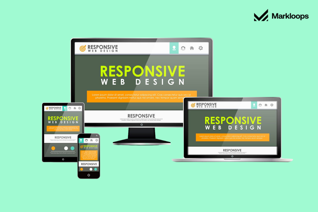
A responsive website adjusts its layout to fit the screen size, whether it's a phone, tablet, laptop, or desktop computer. Because mobile browsing is mainly employed to access the internet worldwide, businesses without a responsive website stand to lose visibility, traffic, and conversions.
What Is Responsive Web Design?
Responsive web design refers to a site's ability to automatically resize its layout and content, taking into consideration the orientation and size of the viewing device. By using flexible grids, scalable graphics, and clever CSS techniques like media queries, the website standardizes user experiences across any platform.
At Markloops, we assist brands in making this happen via services like UI/UX Design, Figma Design to Shopify Store, and WordPress Development. Whether you're creating something from scratch or renovating a current website, our team is dedicated to constructing intelligent and expandable solutions that suit today's online requirements.
Why Businesses Can't Afford to Dismiss Responsive Design in 2025
1) Mobile Traffic Rises to the Top
Mobile-first browsing is becoming increasingly dominant. People now research products, read reviews, and complete purchases on their phones. If your website isn’t functioning correctly on mobile, you’re not just missing out on trust; you’re turning away potential customers.
At Markloops, our UI/UX Audit will determine areas of weakness in your site's layout and user experience. From there, we can build a New Store or customize an Existing Store to better suit today's usage habits.
2) Search Engines Prefer Mobile-Friendly Sites
Google gives preference to mobile versions of websites when ranking and indexing pages. This means your site’s performance on mobile devices plays a key role in where it appears in search results.
Responsive web design directly contributes to improved rankings. Our SEO and Site Speed, and Performance Optimization services align your website with search engine preferences to drive more organic traffic.
3) Improved Conversion Rates
When users arrive on your site and everything loads rapidly, appears tidy, and functions properly, they're much more likely to act. Whether they're purchasing, filling out a form, or joining a newsletter, a responsive design facilitates these actions by eliminating roadblocks.
At Markloops, we also specialize in Checkout Extensibility for Shopify shops, empowering you to create a smoother progression from product pick to purchase across any device.
4) Economical Maintenance
Rather than keeping multiple site instances up to date (desktop and mobile), responsive site design ensures clean updates and testing. It implies less time spent repairing broken items and more time enhancing your online presence.
From App Integration to Connecting ERP to Shopify, our team makes your systems efficiently and effectively connected and scalable, keeping your business agile and efficient.
5) Improved Brand Perception
First, impressions count. A sleekly designed website that's visually arresting and functions like a charm on any device seems to say that your business is as professional as it is reliable; alternatively, a slow and nonresponsive site will impress clients with an image of age-old attitudes towards business.
Our graphic design and brand identity services show how well your brand will display in an online environment, communicating your values clearly and confidently on every page of your website.
What does a Responsive Site mean?
Responsive design isn't letting the content shrink to small sizes. It involves adjusting design elements to match how users interact with different devices. Here are some key features:
- Flexible Layouts: Fluid grids that adapt depending on screen size.
- Adaptive Images and Videos: Content that resizes or loads in varying levels of quality based on device capabilities.
- Mobile-Friendly Navigation: Big buttons, dropdown menus, and tap-friendly areas.
- Fast Load Times: Content that loads quickly and keeps bounce rates low.
- Consistent Visual Style: Consistent branding through fonts, colors, and layout decisions across all devices.
With our Prototyping services, we see every detail before development starts, so you'll know exactly how your site will look on every screen.
Tools to Evaluate Your Website’s Responsiveness
If you’re unsure how your current site performs across devices, start with tools like:
- Google’s Mobile-Friendly Test
- Chrome DevTools (Responsive Mode)
- GTmetrix or PageSpeed Insights for speed testing
Pair these insights with a UI/UX Audit from Markloops to uncover deeper issues and opportunities.
Success Stories Across Industries
Responsive web design impacts all industries:
- Retail & E-Commerce: Businesses see higher retention and fewer cart abandonments with Shopify sites optimized by our team.
- Service Providers: Local businesses reach more customers with responsive WordPress websites.
- Education Platforms: We’ve supported learning platforms with mobile-friendly designs that support video and course modules.
- Healthcare Providers: Improved mobile interfaces allow patients to book appointments or access records.
Our cross-industry experience includes Migration services, Custom App Development, and Digital Marketing Campaigns that support responsive site performance.
How to Prepare for 2025
Here are a few steps to future-proof your website:
- Work With Experts: Employ developers familiar with recent tools such as Bootstrap, Flexbox, and Grid Layout. Our Hire Project-Based Developer program provides you with professionals for short-term or long-term projects.
- Prioritize Speed: Compress images, eliminate code bloat, and check site performance regularly with our Site Speed Optimization service.
- Mobile User Design: Use readable headlines, brief paragraphs, and simple layouts. With Email Marketing Design, we also help ensure mobile consistency across every channel of communication.
- Combine Intelligent Marketing: A well-designed website should be accompanied by other channels. That's why we also provide Google Ads, Email Marketing, Social Media Marketing, and Content Marketing for traffic, visibility, and conversion purposes.
Conclusion
A responsive site isn't simply about how it looks; it's about how it performs, ranks, and projects your business in a digital-first world. Consumers in 2025 will anticipate sites to be fast, uncluttered, and uniform on every device. Anything less may cause you to lose their attention.
Whether you're starting from scratch, upgrading your online store, or fixing slow load times, Markloops is here to help. Our full-service approach, from UI/UX Design to Custom App Development, ensures your business is ready to succeed in the year ahead.
Let’s build something innovative. Contact us at Markloops today.